While building my Korean typing practice game type.sam.today, I wanted to do something that seemed really simple; change the text’s color key-by-key as you type it. While this is really simple for English, Korean’s writing system Hangul combined multiple syllables into a single character, complicating this task:
This post unravels the intricacies of the Korean keyboard, Unicode, and OpenType needed to build a text coloring system. We'll delve into the unique structure of Korean syllables, the limitations of existing Unicode representations, and the creative solutions required to achieve key-by-key text coloring.
What’s a Hangul Syllable?
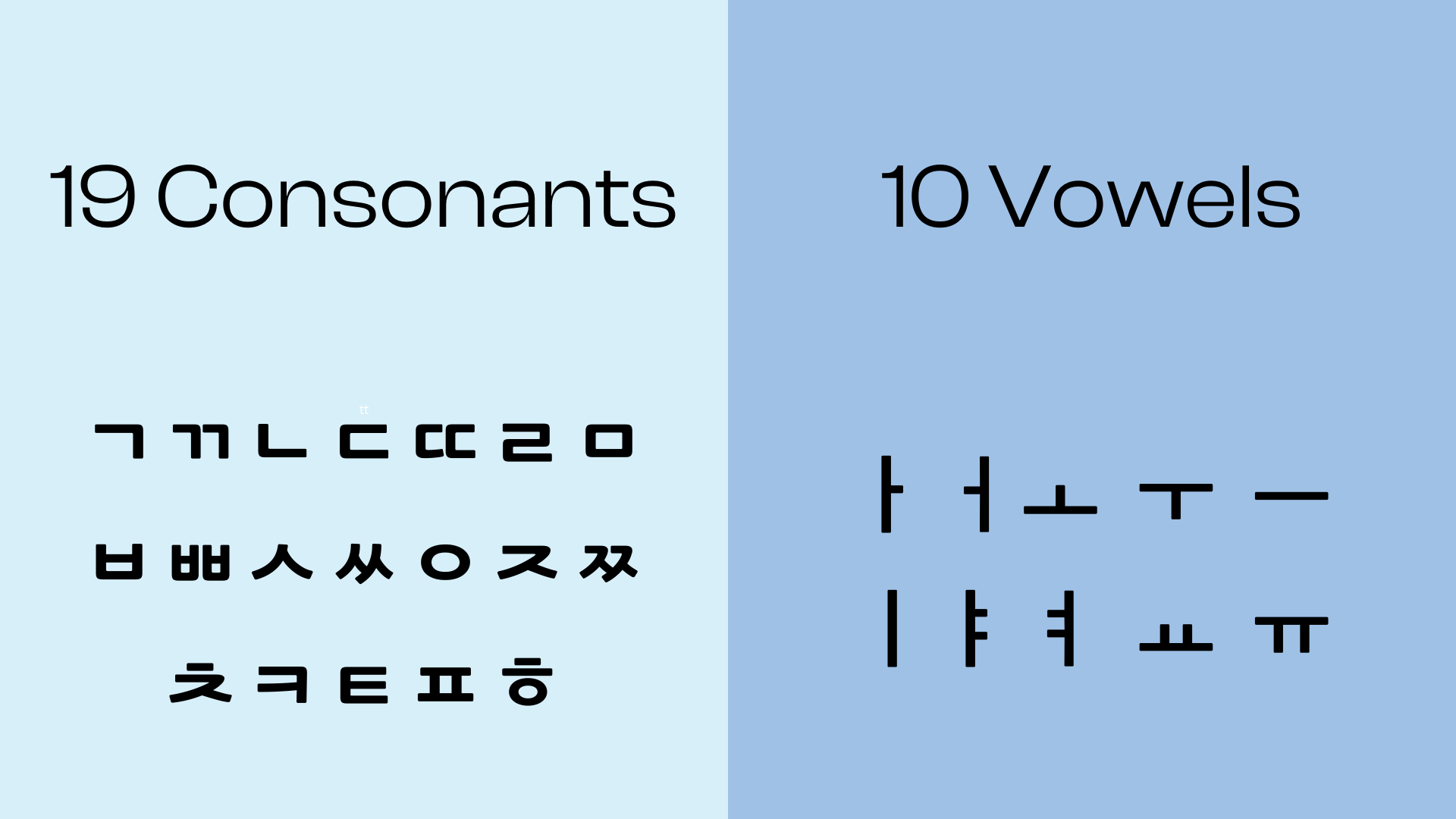
Korean’s more similar to English than it might first appear. Hangul is a phonetic script made up of 10 basic vowels and 19 consonants collectively referred to as “Jamo” (an abbreviation of their Korean words 모음 and 자음).
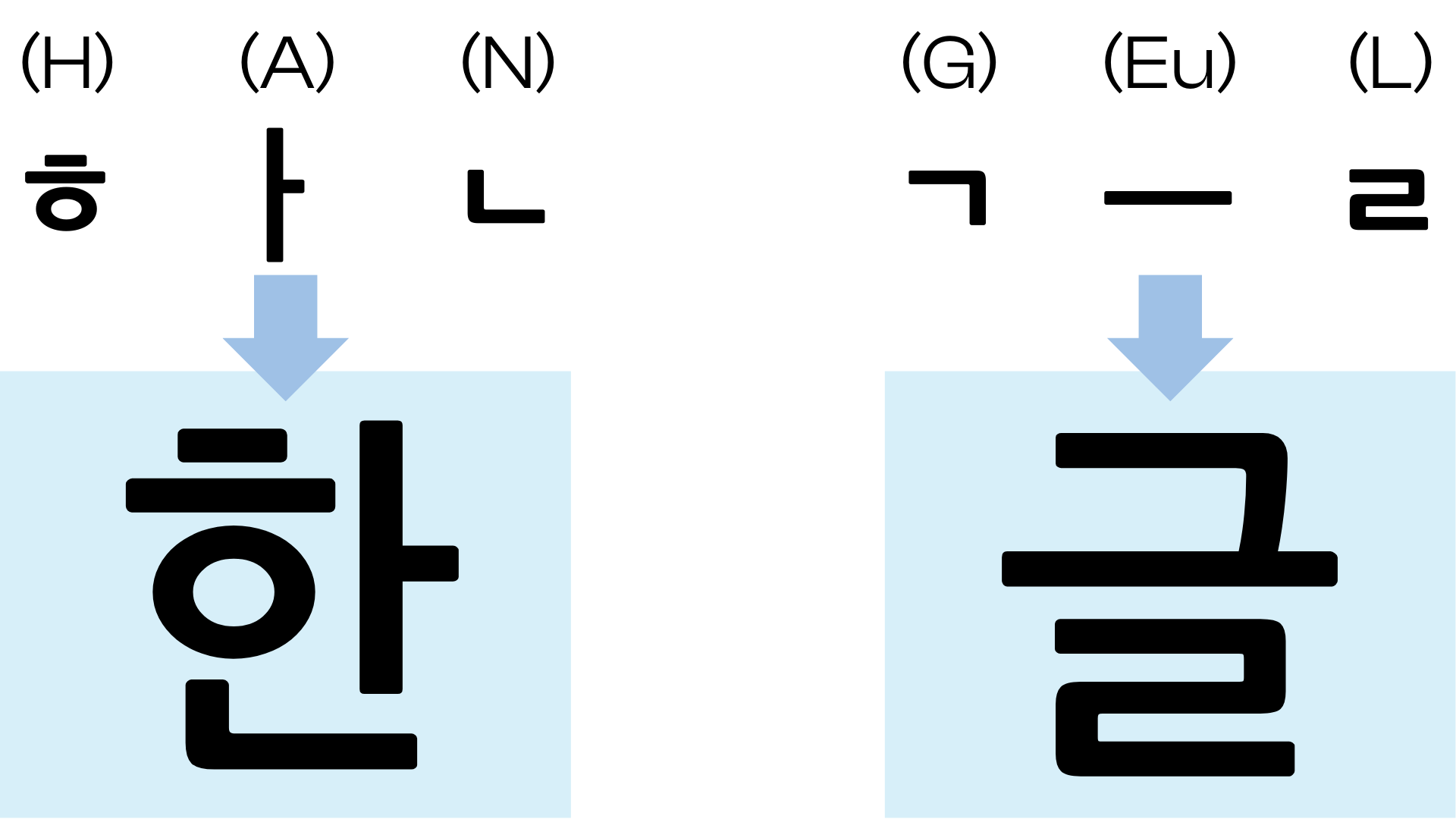
Uniquely, Hangul groups Jamos by syllable. For example, the word “Hangul” corresponds corresponds to the Jamos ㅎ ㅏ ㄴ ㄱ ㅡ ㄹ (H·A·N·G·U·L). But this is written in two groups: 한글 (Han·Gul). Each syllable consists of 1 leading consonant, 1-2 vowels and 0-2 final consonants.
There’s a total of 19 different leading consonants, 21 valid vowel combinations and 27 valid final consonant combinations. That became the 11’172 (19 × 21 × 27) Hangul Syllable unicode block; the composed (NFC) form of Hangul in Unicode.
A 11’172-key keyboard?
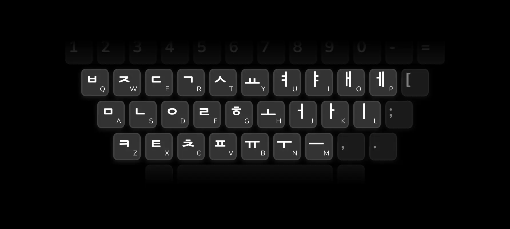
Hangul has a similar number of Jamo (29) as English has letters (26). Additionally, Hangul doesn’t have cases (upper/lowercase), so the Shift key can be used to squeeze 29 Jamos onto the 26 English letter keys with relative ease:
When typing Hangul, you type the Jamos in the order you’d pronounce them. As you type, the computer agglomerates the Jamos into a syllable.
This reveals our main challenge: to color the progress of typing a string, we need to represent the string in a way that matches how somebody types it. This isn’t something needed by everyday korean typing. Does unicode or our font even have this representation?
BTW: mobile typing
Sometimes analog concerns translate really well to the digital world.
Hangul is a relatively new writing system, being invented in the 1400s. Before Hangul, Korean was written with intracicate Chinese characters. So Hangul’s inventors focused on making letter forms simple enough to write with a stick in the dirt. Vowels exemplify this; traditionally they can be written using just dots and straight lines:

When 10-key flip phones came along, this simplicity was advantageous. For example, the 10 vowels can be condensed down to 3 keys; dot and 2 lines. Additionally, consonants with related pronunciation are written in similar forms, so can naturally be put on the same key. Compared to an English 10-key layout where you cycle through unrelated letters, the Korean 10-key layout makes intuitive sense:
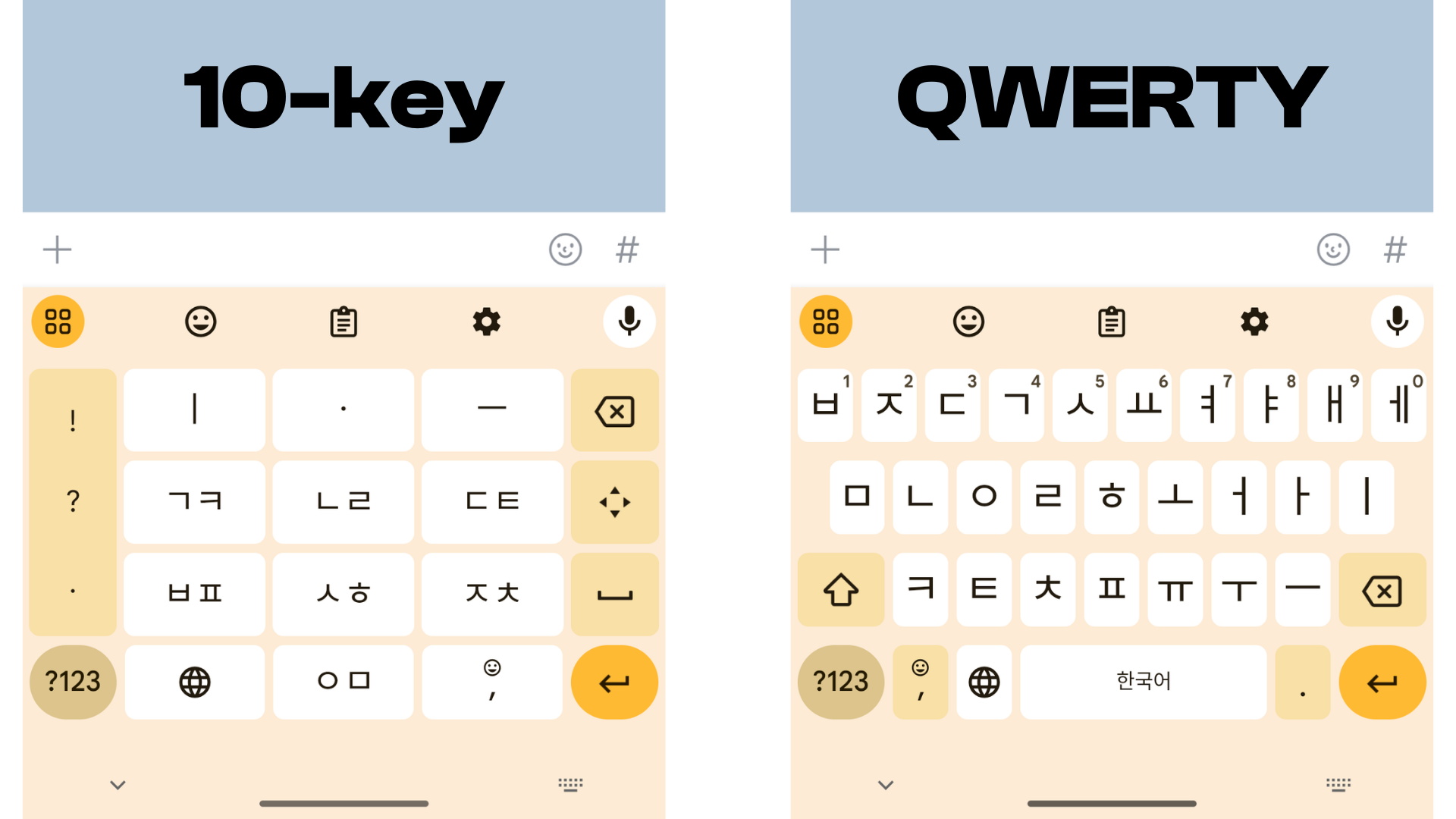
As a westerner in Korea, I was taken aback by the popularity 10-key layout. Even among people too young to ever have used a physical flip-phone, maybe 50% use a 10-key layout on their smartphones! For simplicity, the rest of this blog post will focus on the QWERTY keyboard only.
Unicode’s many representations of Hangul
Unicode has multiple character representations of Hangul.
As mentioned earlier, the representation is the “composed” (NFC) Hangul Syllables block. Here, one Unicode character represents an entire Hangul character; 1 leading consonant, 1-2 basic vowels and 0-2 trailing consonants. This doesn’t help us, because 1 syllable might use up to 5 key presses.
| Syllable (NFC) | Key Presses | Note |
|---|---|---|
| 가 | ㄱ ㅏ (2) | No trailing consonant |
| 원 | ㅇ ㅜ ㅓ ㄴ (4) | 2x vowel |
| 닭 | ㄷ ㅏ ㄹ ㄱ (4) | 2x trailing consonant |
Initially, the “decomposed” (NFD) representation looked promising. Decomposing a Hangul Syllable gives you up to 3 characters from the Hangul Jamo block. The Hangul Jamo block is further divided into 초성 (leading consonants), 중성 (vowels) and 종성 (optional trailing consonant).
| Syllable (NFC) | Jamos (NFD) | Key Presses |
|---|---|---|
| 가 | ᄀ ᅡ (2) | ㄱ ㅏ (2) |
| 원 | ᄋ ᅯ ᆫ (3) | ㅇ ㅜ ㅓ ㄴ (4) |
| 닭 | ᄃ ᅡ ᆰ (3) | ㄷ ㅏ ㄹ ㄱ (4) |
However, this is not useful for our purposes, as there is still some logical composition in the Jamo (NFD) representation. There are characters representing each double trailing consonant. For example ㅄ is a single character made up of 2 individual consonants.
There is also the Hangul Compatability Jamo block, which includes representations of Jamo without a position. These are not mapped by standard Unicode mappings (NFC/NFD) as such a mapping would be lossy. For example:
| Jamo (NFD) | Compatibility | Key Presses |
|---|---|---|
ㅅ (leading) |
ㅅ (compatibility) |
ㅅ |
ㅅ (trailing) | ||
ㅄ (trailing only) |
︄ㅄ |
ㅂ + ㅅ |
ㅙ (vowel) |
ㅙ |
ㅗ + ㅐ |
Despite Unicode’s numerous representations of Hangul, none cleanly map to key presses in all cases.
While this wasn’t ideal, I was hopeful. If the font mapped well to Hangul Jamos (NFD), I’d get most of the way to proper colouring (except for double jamos). However, life has a way of throwing you lemons…
Aside: this isn’t just needed by typing applications
Normalizing a string into keystrokes might seem like an esoteric need of typing-practice-applications, but it is far more commonly needed. Take search and filtering for example: when I’m searching in English, I’d expect “do” to match “dollar” as it’s an intermediate typing state.
In the same way, a Korean user would expect 우 to match 원 if they’re filtering a list of currencies. But that’s rarely the case, because of the double vowel. The NFD decomposition uses Hangul Jamos, so 우 becomes ㅇ ㅜ, which is not a prefix of 원's 3 NFD characters (ㅇ ㅝ ㄴ).
Even amongst Korean apps, this is inconsistently handled. For example, when searching for a park (공원) in Naver Maps, park-related search suggestions disappear while you’re in the middle of typing the 2nd syllable.
Hangul Korean font construction
Astute readers might have noticed that Jamos are arranged in an interesting way when creating Hangul Syllables. Depending on the vowel used the consonant can look quite different. Additionally, the consonant can look different in the leading and trailing positions. For example, ㄱ (the g/k sound):
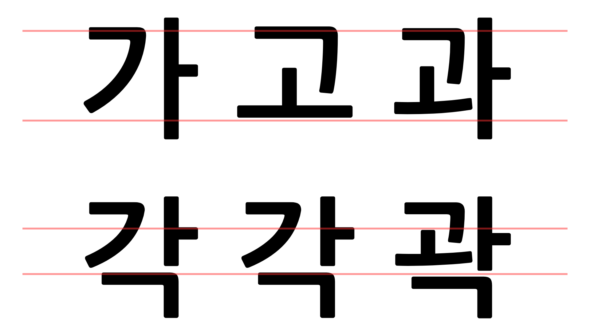
Each Syllable is a unique in some aspect of layout or composition. This should’ve been a sign that things were about to get messy…
A red herring: composite glyphs
After picking a font, I loaded it up with opentype.js to see if there was anything useful. Perhaps I’d find a way in the font to separate the Jamos making up each Syllables, then I’d have the relatively easy task of splitting composite Jamos into keystrokes.
I saw some of the Hangul Syllables actually composite glyphs corresponding to the Jamos. Eureka!
On further inspection, only 80% of the Hangul Syllables were composite glyphs in this font. After cross-referncing with a list of common korean words, none of the syllables in my wordlist were composite glyphs.
As you can see visually, the font author had made edits to each syllable to maintain a balance in each character. Sadly, this means some per-syllable work would be needed from my part.
A bit of elbow grease
In the end, I decided to plug the gaps with some elbow grease. I imported each glphy into a purpose built program, where I’d tag which path corresponded to which key-press or split paths which corresponded to multiple.
I implemented some high-precision, low-recall heuristics to ease the workload as much as possible with minimal development time:
- While there were 50k unique paths in this font (~4 per syllable), there were only 1.6k unique paths after rudimatiary normalisation for position & scale. So where possible tagging was done per-path rather than per-character.
- When a path was used across multiple syllables, if there was only 1 common jamo amongst those syllables, it could be automatically assigned. That assigned about 50% of the paths, saving significant work!
I’m not entirely satisfied with the solution, but my focus was getting this built in service of the keyboard practice app. If the need ever arose to have a wider variety of fonts, I think there’d be opportunities to integrate CV / ML to automate more of the tagging.
Putting it together
After much ordeal, this comes together in type.sam.today to highlight your typing progress:
In particular, I’m happy with how this solution remains true to the font (Nanum Gothic), as the prior art I saw involved creating a custom font that didn’t have the same level of per-syllable finessing as a real font. I hope that people who use type.sam.today never think about the stupidity behind the colors, and instead question why other educational Korean apps don’t have per-jamo color coding were appropriate.
I hope you enjoyed this article. Contact me if you have any thoughts or questions.
© 2015—2025 Sam Parkinson